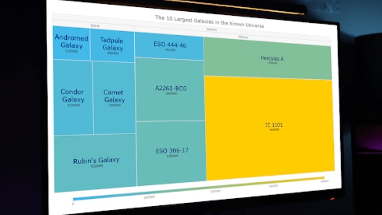
Treemap charts are a type of graphic that is used to display hierarchical data in a space-efficient manner. They are often used to show relationships between different data points, as well as to visually illustrate how a particular data set is organized. These charts make it easy to see which category is the largest and which is the smallest. You can also see how the data is distributed within the different categories. Keep reading to learn more about treemap charts and how they can be used to your advantage.
What are treemap charts?
So, what is a treemap chart? A treemap chart is a graphical tool that uses nested rectangles to represent the hierarchical structure of data. The width and height of each rectangle are proportional to the value of the data it represents. Treemap charts can be used to display data at any level of detail, from individual items to aggregated totals. They are especially useful for displaying large amounts of data in a small space.
Treemap charts are created by dividing a rectangular area into a series of nested rectangles, with each rectangle representing a different level of detail in the hierarchy. The size and shape of each rectangle are determined by the value of the data it represents. For example, in a treemap chart depicting sales data, the width and height of each rectangle might be proportional to the number of units sold. In a treemap chart depicting budget data, the width and height might be proportional to the amount budgeted for each category.
What are the benefits of treemap charts?

There are many benefits of treemap charts as they are a powerful data analysis tool. These graphs are very effective at displaying hierarchical data, displaying data size, and highlighting important data. Hierarchical data is data that is organized in a tree-like structure. For example, the list of countries in the world can be organized into a hierarchical structure by dividing it into continents, then into countries within each continent. Treemap charts are very effective at displaying hierarchical data. This is because they use nested rectangles to represent the hierarchy. The larger the rectangle, the greater the value. This makes it easy to see the relative size of each value and the hierarchy of the data.
Treemap charts are also very efficient at displaying data size. This is because the size of each rectangle is proportional to the value it represents. So, the larger the rectangle, the greater the value. This makes it easy to see which values are the largest and which ones are the smallest. Additionally, treemap charts are also very effective at highlighting important data. This is because they use color to indicate the value of each rectangle. So, the higher the value, the brighter the color. This makes it easy to see which values are the most important.
Are there any limitations to using treemap charts?
Treemap charts are dynamic data visualization tools used to illustrate hierarchical data in a graphical format. Treemap charts can be used to show both absolute and relative values. However, there are some limitations to using treemap charts. One limitation of treemap charts is that they can be difficult to read if there are too many nodes and/or if the nodes are too small. Additionally, treemap charts can be difficult to create if there are a large number of nodes. Another limitation is that treemap charts can be difficult to update if the underlying data changes.
Treemaps are a great way to show how much space is taken up by each item on a list. They can also be used to show how much each category contributes to the whole. This can be helpful for making decisions about how to allocate resources.


